Turning sun protection into an actionable habit-forming app.
/ WHAT I DID
User Interviews & Surveys
Competitive Analysis
Primary + Secondary Research
Design System
Brand Direction
Wireframing & Prototyping
/ tools
Figma
After Effects
Premiere Pro
Nano Banana
Flow
Overview
Sun protection is one of those things most people intend to do, but often forget or skip in everyday life. Glint is a mobile app that helps bridge the gap between awareness and action, making sun safety feel less like a chore and more like a natural part of a daily routine.
Challenge
How might we help people build consistent, long-term sun protection habits instead of relying on good intentions alone?
My Role
As my capstone project, I owned the entire process solo, taking it from an open-ended idea through research, branding, and high-fidelity prototyping. I brought in outside perspective by reaching out to industry designers for feedback throughout the process and shaped the design into a fully realized product ready to be delivered.
/ context
The problem isn’t awareness. It’s follow-through.
Sun exposure is highly preventable, yet inconsistent protection puts 1 in 5 people at risk of skin cancer by age 70 and is the leading cause to visible aging.
People already know they should protect themselves. The challenge is doing it consistently.
Opportunity → Product
Existing competitors tend to focus on either environmental data or reminders. Rather than another UV tracker to the market, Glint explores what happens when those pieces come together in one personalized experience.

/ Goal
Create an experience that feels effortless, empowering, and actually fits into daily life.
/ Mission
To motivate people to build consistent, long-term sun protection habits.

/ Solution
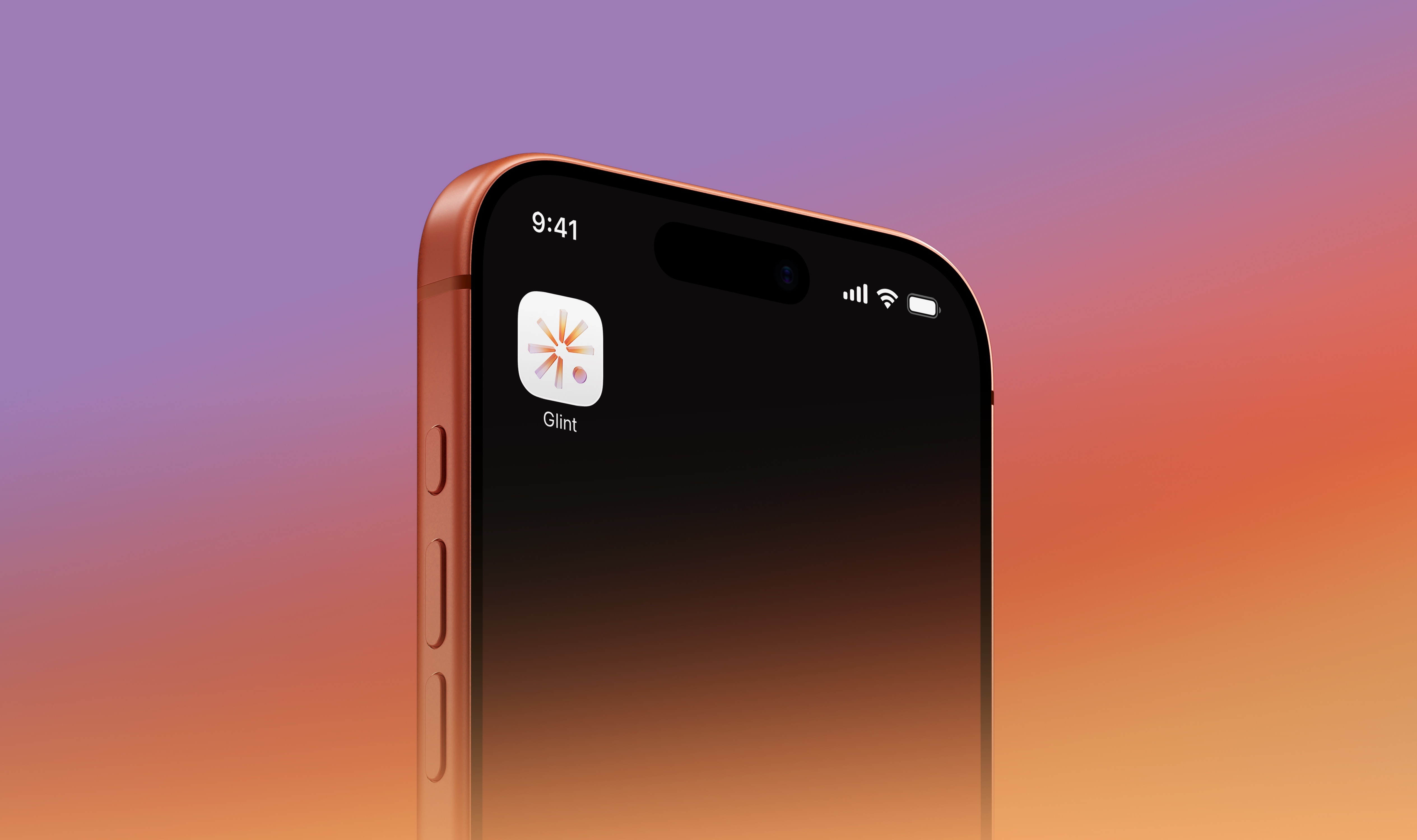
Glint: Sun protection, built into your day.
Glint connects daily UV guidance, habit tracking, and bite-sized education to make it easier to know when to act and build habits that last.
/ Research
Start with the reasons people fall out of the habit.
45
Survey responses
10
One-on-one interviews
1
Dermatologist interview
Backing up a bit, to get at why people weren’t following through with sun protection, I ran a study with surveys and interviews. To help synthesize themes faster, I used Claude and Gemini Notebook to separate what people said the problem was from what was actually driving the behavior.

Forgetfulness
Protection can slip the mind without established routines or timely reminders.
Inconvenience
Sunscreen feels like an extra, messy, time-consuming step in busy schedules.
These two barriers stood out and shaped Glint’s reminders, quick habit logging, UV guidance, and flexible ways to protect yourself, with or without sunscreen.
/ Explorations
From showing information to guiding action.


Speeding up the workflow.
I used AI to explore visual assets, generate realistic product content, and animate the logo. Tools like Nano Banana and Flow helped me move faster on production tasks and spend more time refining the actual experience.
/ Reflection
Signing off!
What's next
Glint is currently a high-fidelity prototype so if I continued the project, I'd build beyond Figma, put the experience in people's hands, and learn which features actually help sun protection become a lasting habit.
Keep it simple
Glint taught how to make the smart choice the easy one. Sometimes, the best design is about stripping things back and making the right action feel effortless. For me, that’s a reminder to always ask: how can I make this simpler?